
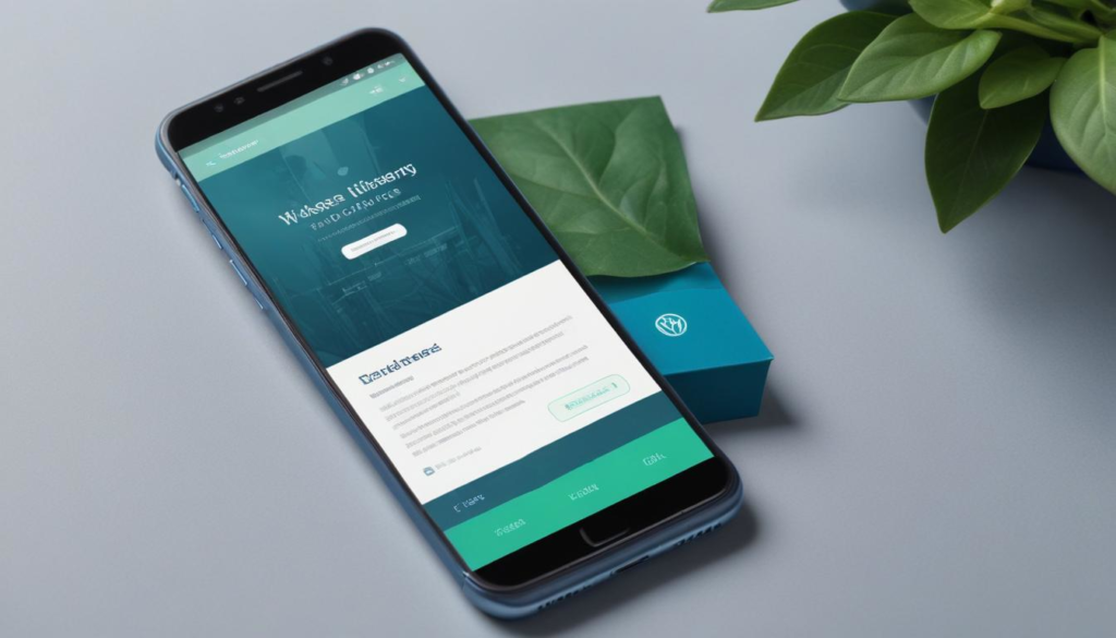
The rise of mobile browsing has made adopting mobile-responsive WordPress themes essential for providing an optimal user experience on different screen sizes. These themes automatically adjust layouts and components, enhancing accessibility, usability, and boosting user engagement while lowering bounce rates. Mobile-responsive designs are crucial for SEO as mobile-friendly sites rank higher in search results. Despite challenges like customization limits, platforms like WorldPressIT.com offer affordable access to a vast array of premium themes and plugins under GPL licensing. Implementing responsive design principles and optimizing images significantly enhances mobile performance and site speed, crucial factors favored by search engines. Embrace mobile-first practices to maintain competitiveness and ensure your site’s success in the digital landscape.

Spring 2026
Spring Sale is live!
Fresh savings on our most powerful unlimited plan — 30% OFF Gladiator - March 2026 ONLY
Includes automatic WP Dashboard updates.
Includes automatic WP Dashboard updates.
Loading...
Loading…
Unlock 30% OFF Gladiator →
